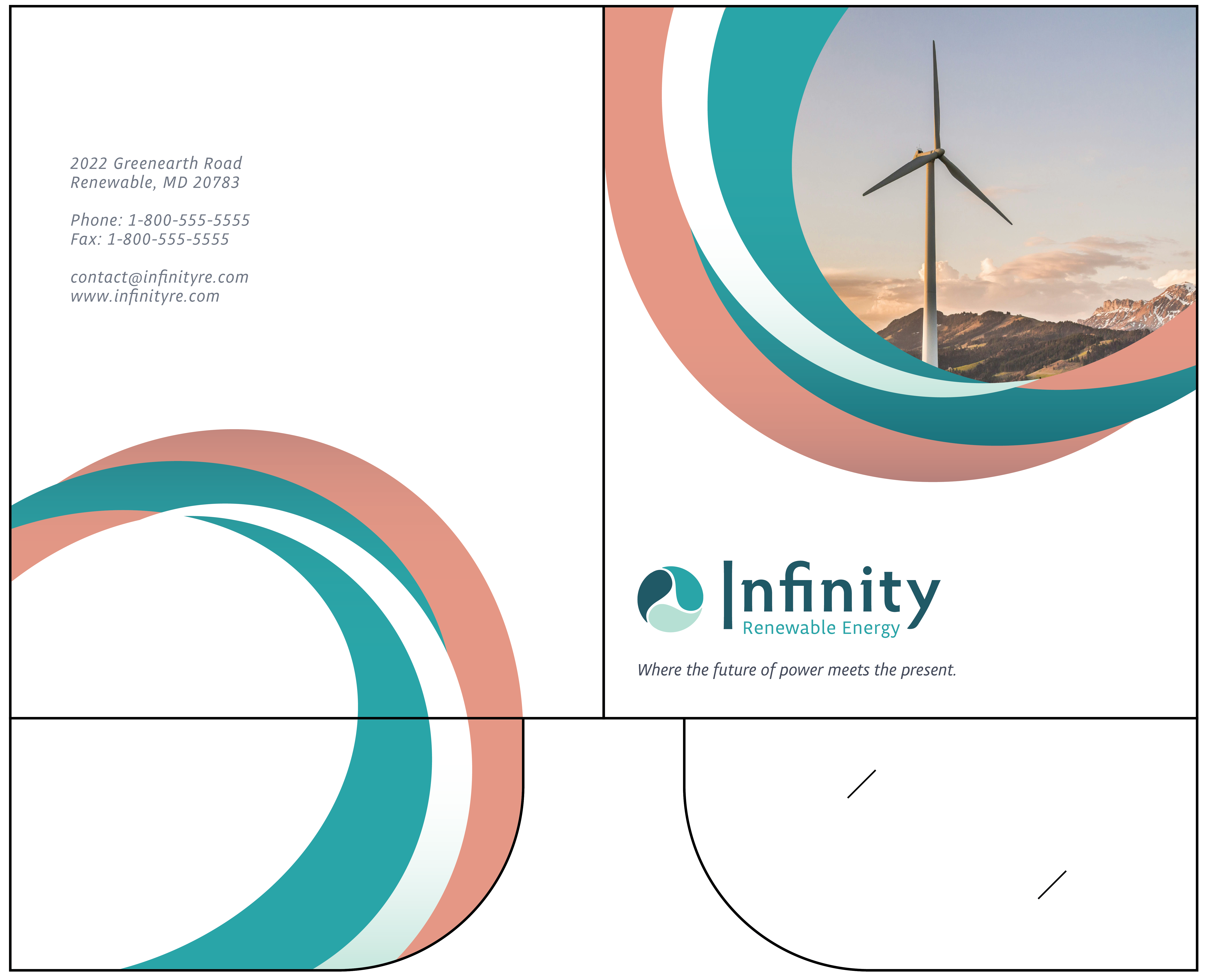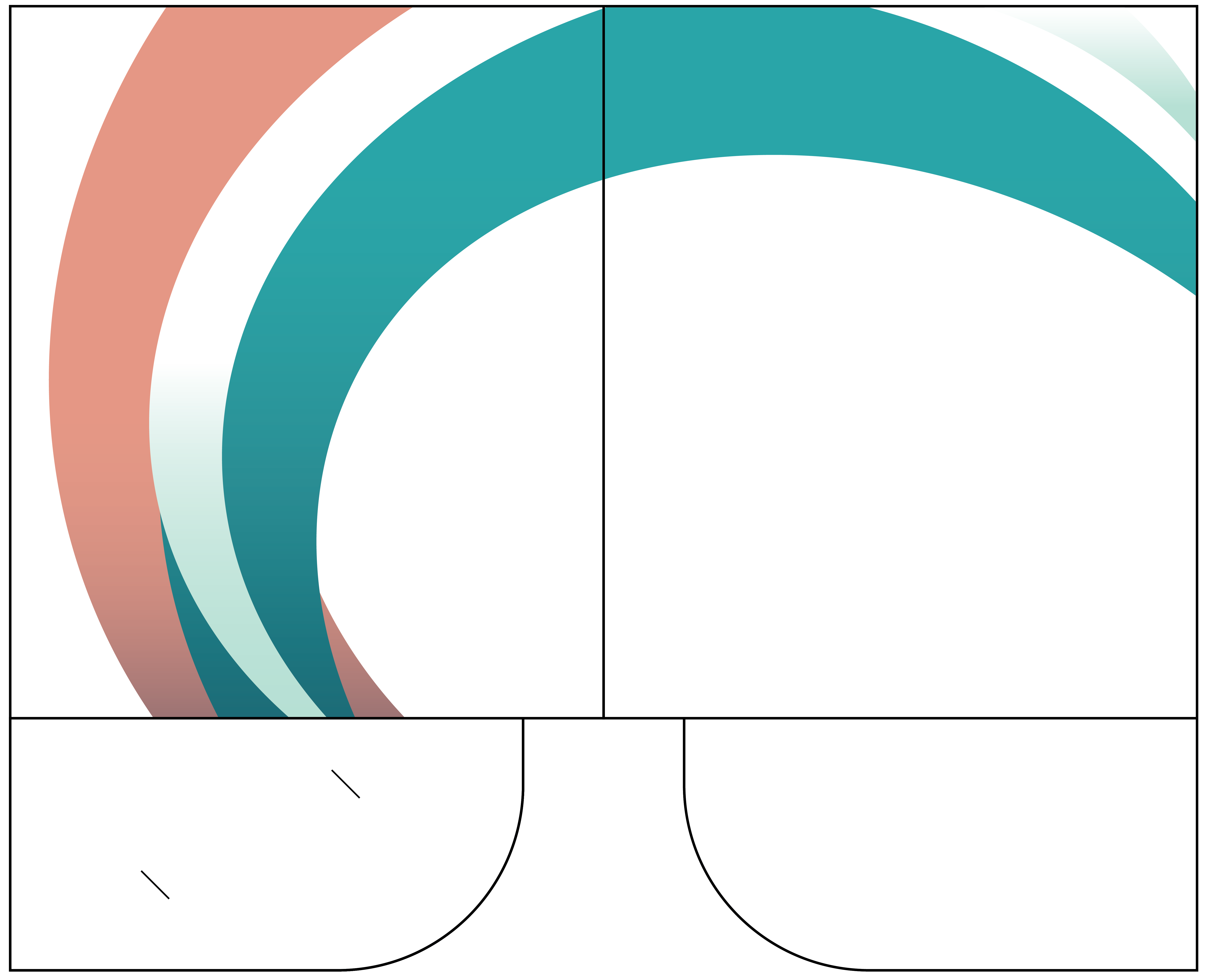
The next assignment required a design for an IRE-branded folder for use at a business conference. I incorporated new secondary colors in orange and gray to bring contrast to the existing teal-centric palette. My goal was to say a lot with a little; I implemented the colored curves because they felt lively yet refined while uniting the design with the round motif of the logo. Completed in Adobe Illustrator.